IN
DEGREE PROJECT INFORMATION AND COMMUNICATION
TECHNOLOGY,
SECOND CYCLE, 30 CREDITS ,
STOCKHOLM SWEDEN 2019
Interactive visualization of radio
waves propagation in 5G massive
MIMO
WOJCIECH ADASZYNSKI
[English] Title
Interactive visualization of radio waves propagation in 5G massive MIMO
AbstractThe complexity of advanced antenna techniques used in the new generation of wireless networks (5G) makes communication between experts and non-technical staff more difficult than ever. As cooperation between network vendors and network operators affects the adoption of the new standard, a need for a new tool has emerged to make technical presentations more engaging and compelling. This thesis presents an exploratory study that aims to examine various design options for an interactive visualization of radio-wave propagation to be used by advanced antenna systems experts. Through a Research-oriented Design, functional and non-functional requirements were identified with the help of domain expert. Later, an in-teractive prototype was designed and developed using a participatory design approach. Qualitative and quantitative data was gathered through usability testing, System Usability Scale (SUS) questionnaires and semi-structured interviews conducted with 12 researchers and engineers at Ericsson AB - a multinational telecommunication company. User evaluation proved that such a tool could facilitate communication between technical experts and non-technical staff. The developed prototype was considered intuitive and useful by the majority of study participants as measured by interviews and the SUS survey. Future research is encour-aged to include the target audience representatives in order to measure their engagement while using the tool.
[Svenska] Titel
Interaktiv visualisering av radiovgsfrkning i 5G Massive MIMO
AbstractKomplexiteten hos avancerade antenntekniker som anvnds i den nya generationen av mobilntverk (5G), gr kommunikationen mellan experter och icke-teknisk personal svrare n ngonsin. Eftersom samarbetet mellan telekommunikationsfretag och ntoperatrer pverkar anpassningen av den nya standarden, har behovet av ett nytt verktyg uppsttt fr att gra tekniska presentationer mer engagerande och vertygande. Avhandlingen pre-senterar en underskande studie som syftar till att underska olika designalternativ fr en interaktiv visualisering av radiovgsfrkning som anvnds av avancerade antennsystems experter. Genom en forskningsinriktad design identifierades funktionella och icke-funktionella krav med hjlp av en domnexpert. Senare konstruerades och utvecklades en interaktiv prototyp med hjlp av en co-operativ designmetod. Kvalitativa och kvantitativa data samlades in genom anvndbarhetstester, System Usability Scale (SUS) - frgeformulr och halvstrukturerade intervjuer med 12 forskare och ingenjrer p Ericsson AB - ett multinationellt telekommunikationsfretag. An-vndarutvrdering visade att ett sdant verktyg skulle underltta kommunikationen mellan tekniska experter och icke-teknisk personal. Den utvecklade prototypen ansgs intuitiv och anvndbar av majoriteten av studiedelt-agarna, mtt genom intervjuer och SUS-underskningen. Framtida forskning uppmuntrar till att inkludera mlgruppsrepresentanterna fr att mta deras engagemang medan de anvnder verktyget.
Interactive visualization of radio waves propagation
in 5G massive MIMO
Wojciech Adaszyński wojada@kth.se
KTH - Royal Institute of Technology Stockholm, Sweden
ABSTRACT
The complexity of advanced antenna techniques used in the new generation of wireless networks (5G) makes com-munication between experts and non-technical staff more difficult than ever. As cooperation between network vendors and network operators affects the adoption of the new stan-dard, a need for a new tool has emerged to make technical presentations more engaging and compelling. This thesis presents an exploratory study that aims to examine various design options for an interactive visualization of radio-wave propagation to be used by advanced antenna systems’ ex-perts. Through a Research-oriented Design, functional and non-functional requirements were identified with the help of domain expert. Later, an interactive prototype was designed and developed using a participatory design approach. Qual-itative and quantQual-itative data was gathered through usabil-ity testing, System Usabilusabil-ity Scale (SUS) questionnaires and semi-structured interviews conducted with 12 researchers and engineers at Ericsson AB - a multinational telecommu-nication company. User evaluation proved that such a tool could facilitate communication between technical experts and non-technical staff. The developed prototype was con-sidered intuitive and useful by the majority of study partici-pants as measured by interviews and the SUS survey. Future research is encouraged to include the target audience repre-sentatives in order to measure their engagement while using the tool.
KEYWORDS
Visualization, Interface design, Participatory design, Affec-tive visualization, Massive MIMO, Beamforming
1 KEY TERMS
AAS - Advanced Antenna Systems
Null - a place where signal interference is minimized BS - Base Station - a piece of network equipment that enables communication between devices and network. Base stations are placed in fixed locations.
UE - User Equipment - an element of a wireless network that communicates with other devices through a base station.
2 INTRODUCTION
Various factors influence the adoption of new technologies. Nowadays, technical superiority over existing solutions itself cannot guarantee the commercial success of a product. “The innovator’s dilemma” book by Clayton M. Christensen [9] suggested that technological disruptions are marketing prob-lems, not technical ones. Companies have to assess whether investing in new technological advancements is worth the potential gain. In the current environment, they need to make their decisions quickly to stay economically compet-itive and retain their customers. Visual aids that facilitate critical thinking proliferated among business circles. Infor-mation Visualization, once a purely academic field, has been adopted in presentations and reports. For the last few years, telecommunication companies’ research and marketing ef-forts have been focused on standardizing and promoting the next generation of cellular networks (5G). Yet, before reaching end-customers, mobile network operators have to become committed to the change and ready to invest their resources in this novel technology. Besides strictly economic and technical aspects, organizational and social factors play an important role in the pace of change in large corpora-tions. People tend to hold deep-rooted beliefs and opinions that can only be changed through thoughtful education. One way of doing so utilizes media to persuade business part-ners in investing in this novel technology by showing the core concepts of 5G networks in a tangible way. This the-sis aims to explore the use of visualizations in supporting knowledge transfer between technical experts in the field of multi-antenna techniques and people with little to no experience in that field. The study aimed to examine the affordances and limitations of an interactive visualization tool that would be used by researchers and engineers during meetings with business partners. The goal of this use-case study was to design, implement and evaluate a design arti-fact [10] through Research-oriented design. Feedback from potential users in a form of qualitative and quantitative data was gathered through standard usability methods as well as semi-structured interviews. Due to its exploratory nature, the research was conducted in an iterative cycle of design, implementation and testing. The study was conducted in a
collaboration with Ericsson AB - a multinational telecom-munications company based in Stockholm, Sweden. The research facilitates explaining key concepts behind the core 5G technologies and is thus a valuable pedagogic tool for Ericsson in customer presentations.
Research Question
What are the affordances and limitations of different design options for interactive visualization of Massive MIMO an-tenna to be used by expert users communicating technical aspects of the technology to people with no experience in the field as measured by System Usability Scale surveys and semi-structured interviews measuring perceived usefulness and ease of use?
3 BACKGROUND
The exponential growth of the mobile market and rising users’ expectations towards the quality of service led to an emergence of the fifth generation of cellular networks. The need of larger bandwidth, lower latency and enhanced user coverage generate a number of technical problems that need to be solved in order to make 5G’s wider adoption possible. Historically, throughput was increased by allocating more bandwidth or building base stations (BS) closer to each other. Unfortunately, frequencies that can be employed in cellular communication are fairly limited due to various regulations and deploying more BS’s is becoming economically unfea-sible. Hence, to fulfill 5G network requirements, advanced signal processing methods need to be employed to reduce superfluous interference and increase throughput.
Performance of current conventional systems for radio access (consisting of a single passive antenna and a remote unit with few radio chains) may not be enough to track the pace of the exponentially growing data usage. Multi-antenna techniques via the use of base stations equipped with Ad-vanced Antenna Systems offer the possibility to substantially improve both spectral efficiency and coverage thereby miti-gating the exponential growth challenge [24].
Compared to conventional ones, AAS radios consist of large arrays of antennas. Their signal transmission and recep-tion are managed by advanced signal processing algorithms that enable AAS features. AAS features include beamforming and Multiple Input Multiple Output (MIMO). Beamforming is an ability to focus radio-wave energy in particular directions, typically directing towards the desired UE while avoiding interference to/from other UE’s. Multiple Input Multiple Out-put (MIMO) is a technique that allows sending multiple data streams from a single AAS radio simultaneously [4]. MIMO can facilitate transmission to a single user (SU-MIMO) as well as multiple users (MU-MIMO). Beamforming is used by both SU-MIMO as well as MU-MIMO. In the case of MU-MIMO, ra-dios need to maintain low radio-wave interference between
users. To do so, radios designate beam properties generation to custom software. As a result, a beam or beams carrying one or more data streams towards the desired UE are created. To avoid interference, the beams have “nulls” in directions towards other co-scheduled UE’s. Combining AAS features with AAS radios delivers a significant improvement in cov-erage, capacity and user experience. However, introduction of such technically-advanced solutions bears many difficul-ties in communicating its capabilidifficul-ties to a larger audience. Therefore, there is a growing need for ways to introduce the topic to people with limited background in the field while capturing their interest and evoking positive feelings. 4 THEORY AND RELATED RESEARCH
Visualization
Visualization is a broad term capturing a variety of computer-generated visual aids that improve human cognition. Al-though visualizations can significantly vary in form depend-ing on their use-cases and target audience, all of them have few things in common: “they make us think more clearly, ap-propriately, with insight and with conviction to act” [19]. Many efforts have been made to create consistent taxonomy of the field, taking different characteristics into consideration. One of the most popular, suggested by Card, Mackinlay and Shnei-derman [6] proposes two categories: scientific visualizations and information visualizations. While the former encom-passes everything that deals with physical data, the latter is much broader, including representations of abstract data as well. Scientific visualizations have been historically associ-ated with researchers who used them to detect anomalies and gain insights after conducting experiments. Because of that, such tools have always been designed with high accuracy in mind. Visualization research community was particularly in-terested in visual efficiency and task-completion times, thus early research heavily relied on usability testing and quan-titative methods. “Data-ink ratio” term coined by Edward Tufte became the standard way of assessing early visualiza-tion techniques. His hypothesis was that any unnecessary visual elements lead to lower comprehensibility, reducing the usability of the tool [31].
In contrast to scientific visualizations, information visual-izations include any type of data. Abstract values that have no physical representation (e.g. language, age or associa-tion) are artificially mapped to visual properties (e.g. color, length or area). Due to our innate capacity to compare and distinguish colors and dimensions, information visualization allows us to explore and analyze large datasets that would have been impossible to work on otherwise. With scientists being the only ones who cared about visualization for a long time, traditional categorization worked well for many years. However, with the rise of the internet and the popularity
of interactive media, another approach was developed to include regular users that became exposed to visualization. Robert Kosara suggested that two cultures exist among vi-sualization practitioners these days: pragmatic and artistic [15]. The first group is concerned about aiding scientists as well as laymen in understanding data. Artistic visualization designers, on the other hand, are more concerned about the story that data tells. Visual efficiency is not their main goal -triggering particular emotions is. In Kosara’s view, informa-tion visualizainforma-tion lives somewhere between pragmatic and artistic variants. As an interdisciplinary field, it requires both technical background as well as a user-centered approach in designing accessible tools. In their paper, Nick Cawthon and Andrew Vande Moere go even further by saying that information visualization is a “convergence of science, enter-tainment and art” [7]. Being heavily inspired by research in Psychobiology, they proposed a new model of evaluating aesthetic effect within user experience of information visual-ization. According to their “aesthetic acceptance curve” (fig. 1), users’ perceived value of the visualization grows (to a certain level) with the increase of the perceived aesthetic value of it.
Figure 1: Aesthetic acceptance curve - user experience grows with aesthetic value. © 2006 IEEE
Donald Norman’s “Emotional Design” [22] is one of the most influential books describing the correlation between the pleasure of aesthetics with perceived usefulness in de-sign. Although focused on industrial design, his work became influential in many fields, spreading to Information Visualiza-tion community as well. Considering usability and aesthetics as non-orthogonal metrics is contradictory to Tufte’s min-imalistic approach that promoted high “data-ink” ratio in information visualization. His idea that graphical ornamen-tation diminish usability was proven wrong in many other user studies [14] [8].
Storytelling in visualizations
In recent years, visualization has been used in more types of media. Newspapers, presentations and political campaigns include bar charts, pie charts and scatter plots to make their message easier to grasp and create compelling evidence for it. Such application reduces users’ ability to freely explore the data, making them mere spectators, instead of active participants in the data exploration. This trend is described in length by Edward Segel and Jeffrey Heer in their excel-lent “Narrative Visualization: Telling Stories with Data” pa-per [27]. The authors suggest that journalists and educators adopting information as a tool unveiled another class of vi-sualizations: narrative visualization. So-called “data-stories” require a diverse set of skills: expertise in statistics, visual design and storytelling. Storytelling, in particular, becomes an important aspect in modern visualizations. Our natural predisposition towards keeping the information as a series of events has been widely studied by psychologists and cog-nitive scientists. Employing “episodic memory” has become a widespread practice among “memory sports” contestants who find it vastly easier to memorize sequences of num-bers as stories. Additionally, experienced or heard stories lead to a process called “episodic learning” [23] that uncon-sciously changes our behavior. Interestingly, storytelling in visualization does not only apply to newspapers and busi-ness presentations. Scientific visualizations made in NASA’s Goddard Space Flight Center and Exploratorium museum in San Francisco made extensive use of narration. Having a general public as a target audience, scientists blended their simulations with stories that made the entire experience easier to consume [17].
Visualization in presentations
Information visualization has become an integral part of pre-sentations in recent years. Kosara and Mackinlay categorize presentations into three categories: self-running, live pre-sentations and individual prepre-sentations [16]. Self-running presentations are viewed by spectators independently, with no interaction with a presenter. In contrast, live presenta-tions require someone who augments visualizapresenta-tions with her/his commentary and can adjust the pace and language to the type of audience she is dealing with. A popular example of a live presentation is Hans Rosling’s Gapminder presen-tation from the 2006 TED event1. Individual presentations
are meant for smaller groups where an audience is an active participant of the show. A presenter needs to be prepared for questions that may affect his or her actions. Interactive visualizations are especially important in individual presen-tations where audience participation is high. Presenpresen-tations
1Hans Rosling - The best stats you’ve ever seen
are particularly popular in corporate settings where commu-nication between parties leads to new business opportunities. Some insights about designing a persuasive presentation can be taken from the work of Lindgaard and Dudek on the con-nection between user satisfaction, usability and aesthetics [18]. Their study conducted on students revealed that users’ satisfaction is rarely related to usability per se. Emotional responses are triggered within 3-4 milliseconds after a stim-ulus is being shown. ‘Primacy effect’ in their mind is the key factor in user satisfaction - people tend to judge people, objects and products based on their first impression. Thus, triggering the ‘wow effect’ may be the single most important aspect presenters should focus on.
Branding
The effectiveness of business presentations heavily relies on communication between customers and company. With the proliferation of social media and the internet, customers’ have become more aware of how companies market to them and their expectations have risen. Moreover, loyalty towards companies has fallen as opinions about products can spread instantly through the internet. Consumer decisions are heav-ily influenced by subjective concepts such as company iden-tity, branding, advertising and channel engagements [30]. Shiva Nadan’s work on brand identity - brand image linkage [20] gives a compelling argument for striving towards supe-rior branding in modern companies: information overload and hyper-competition leads to confusion among clients. Companies not only need to pursue with data, but with emo-tion and affect. Bridging the gap between brand image (what customer sees) and brand identity (what a company gener-ates) is crucial in increasing users’ loyalty towards products. Affective visualization
Another class of visualizations that have been growing in popularity among scholars these days is “affective visual-ization”. A succinct explanation was provided by Bartram, Patra and Stone in their “Affective Color in Visualization” paper [3]. According to them, in contrast to information vi-sualization, it does not intend to inform, rather evoke certain emotions. Many factors contribute to emotions that visual-izations trigger, for example, colors, color palettes [3][26] and motion [2]. Motion, in particular, can become a power-ful tool in designing affective visualizations. Our vision is extremely sensitive to motion and any changes in the posi-tion of objects trigger immediate visceral responses. A study conducted by Bartram and Nakatani found several patterns in mapping between motion patterns and type of emotion they stimulate [2]. While designing a visualization we need to consider how our audience should react to it.
Research-oriented Design
Combining research with design has been an effort of many Human-Computer Interaction (HCI) scholars in recent years. Various frameworks and methods arose to make a formal foundation to ground design explorations upon. Pieter Stap-pers and Elisa Giaccardi provide an extensive overview and historical outline of models that have been developed for the past three decades [11]. One of them, Research-oriented Design, was proposed by Daniel Fallman who contrasted it with Design-Oriented Research. According to him, the dif-ference between the two boils down to the main objective of the design undertaking. The former’s goal is to produce new artifact by studying prior work and following a formalized method while the latter’s main objective is to expand our current knowledge by utilizing design as a method. Both approaches may produce new wisdom, it’s the primary goal that distinguishes them. Design-Oriented research approach usually discards the studied prototype. Practitioners who want to deliver their work to end-users most likely follow Research-oriented design.
Information Visualization Design
Design and development process of any visualization is af-fected by many factors, including the type of target audience and external constraints. A method proposed by Graham, Benyon and Kennedy [12] aims to deliver systems with a high level of usability in a time and resources limited con-ditions. To achieve that, the authors suggest the following principles:
(1) An iterative method of system development should be employed,
(2) Real users have to be involved in the design (partici-patory design),
(3) The focus should be placed on the user goals, instead of features,
(4) A great emphasis should be placed on interface design and its documentation.
These principles were followed by Graham et. al in their use-case study concerning botanical taxonomies visualiza-tion. By aiming to enhance users’ existing tooling while keeping a formalized user research method, the authors have presented how Research-oriented design may apply to infor-mation visualization design.
Related research
Due to the infancy of the field, hardly any research has been made in the visualization of 5G techniques. An interesting approach to presenting 5G-related material to a wider audi-ence was explored in a paper by Phan-Huy et. al [25]. Their “Radio Waves Display” is a physical billboard that visualizes rays of beams produced by multi-antenna systems. Colorful
diodes illuminate radio wave paths, making the beamform-ing technique more tangible for the audience. Although the paper goes to great lengths in describing implementation technicalities, it does not examine an audience’s reaction to the final prototype. Radio Waves Display was built to be presented during Mobile World Congress and, similarly to this project, was meant to illustrate complex technology through a simple and engaging representation.
When it comes to 3D visualizations, 5G techniques have been mostly of scientific community interest. An extension to the Matlab environment, “Phased Array System Toolbox”2,
allows to compute and visualize beam directivity graphs, sim-ilar to those examined in this study.
When it comes to proprietary software, one has to mention Remco Wireless InSite © suite. The software enables visu-alizing 5G networks’ simulations in real-world settings. Its ability to efficiently calculate maximum ratio transmission and zero-forcing beamforming was described in details by Skidmore and Bedrosian [28].
5 METHOD
As in the use-case presented by Graham et. al [12], this project was divided into several distinct phases, each having well-defined goals. Initially, only one domain expert was involved in gathering functional and non-functional require-ments for the project. Then, low-fidelity prototypes were developed using techniques such as paper prototyping and sketching. Having had them as a foundation, initial ideas were refined into a more sophisticated graphical design using vector graphics software. General “look and feel” was vali-dated with branding and UX guidelines provided by Ericsson, making it more intuitive for employees who might be already accustomed to other tools. Based on that design, an initial prototype was developed using web technologies. Next, an iterative cycle of user testing and development was applied. Twelve experts in the field (researchers and engineers) were employed in a user testing on Ericsson’s premises. Testing was divided into three parts: two formative evaluations and one summative at the end of the development. Each part consisted of four sessions with potential users. Each session lasted approximately 45 minutes and included usability test-ing ustest-ing pre-written scenarios, a System Usability Scale (SUS) [5] survey and a semi-structured interview with the participant. While former type of evaluation played a cru-cial role in shaping how the tool should look like, the latter provided a comprehensive evaluation of the design choices.
2Phased Array System Toolbox -
https://www.mathworks.com/products/phased-array.html
Phase 1: Knowledge transfer
The project started by gathering essential technical and non-technical information from a domain expert - researcher in adaptive multi-antenna technology. Through interviews, use-cases of the designed artifact were established: tool would en-able individual exploration by employees and could be used during live presentations with customers and managers. Pre-sentation’s audience would not exceed 100 participants and visualization should be intertwined with slides made in tools such as Microsoft Powerpoint. Having had no experience in 5G networks, extensive notes about advanced antenna systems, terminology, tooling and visualizations used by re-searchers were collected. For the research and development purposes, employees used Matlab numerical computing envi-ronment to simulate and plot various scenarios. Their choice was motivated by purely technical aspects: most of the en-gineers were familiar with Matlab scripting language, the environment was optimized for numerical computations per-formance and provided an excellent plotting functionality. Plots were used to gather new insights and inform users about simulation results with high accuracy. However, when used in meetings with non-technical staff, Matlab-generated plots failed to persuade and engage audience due to their technical appearance and cryptic terminology. Besides aes-thetics, Matlab plots were hard to change during meetings, hence providing low value to create persuading narratives. That issue became even more relevant in conference settings, such as Mobile World Congress - an annual exhibition that concentrates on business presentations made to impress and entice new business partners. For such occasions, external companies were contracted to visualize simulation results using 3D graphics. Such an approach provided excellent aes-thetic value of the visualization but lacked interactivity that, according to the technical expert, is a key aspect in generat-ing audience engagement and involvement.
Picking the right ways to visualize simulation data was not an entirely open problem, some types of visualizations had been used for years in telecommunication community and proved to be easy to read by technical, as well as a non-technical audience. The following list of functional and non-functional requirements was gathered:
Functional requirements:
(1) Visualization should plot radio-wave propagation pat-tern in time on an animated 3D surface plot,
(2) Visualization should plot beam shape using parame-terized 3D surface,
(3) Visualization should take several common parameters as input for plot generation.
(1) The application should provide high level of interac-tivity,
(2) It should be cross-platform, allowing users of different operating systems to run it on their computers, (3) The application should be aesthetically pleasing,
pro-viding smooth transitions and evoking positive emo-tions among its audience,
(4) Visualization does not need to provide high mathemat-ical accuracy but an accurate high-level overview of the phenomena.
Interviews with the expert were also used to gather technical details of charts’ generation. At that time, data for radio-wave propagation and beam shape chart generation was computed using Matlab scripts. Lastly, the meetings provided a description of the target user group and its demographics, making it easier to find suitable user testing participants at Ericsson.
Phase 2: Initial prototypes and development
The first phase provided an excellent foundation for early sketches and prototypes. Having seen Matlab visualizations made by researchers and parameters that affect them, few sketches were made using pen and paper. Using a method called heuristic evaluation [21], different variants were as-sessed without the need of additional study participants. Ini-tially, two use-cases of the tool (individual exploration and group presentation) translated into two separate views - each showing different settings and having a distinct interface layout. That idea, however, was then discarded as evalua-tion of the latter use-case would require to include target audience - Ericsson’s business partners and managers. Unfor-tunately, due to limited resources, such evaluation was not an option at that time. Having refined the sketches, a detailed graphical interface was designed with Figma3- graphical
interface design tool. The rationale for choosing Figma was twofold. Firstly, Figma was one of the only advanced design tools available for Linux distributions when the research was conducted. Secondly, it provides a built-in interaction prototyping functionality that allows mocking some of the basic interactions like clicking or hovering over interface elements. Being able to show interactions (through basic user scenarios) proved to be a great communication tool for collaboration with the technical expert. Not only did (s)he saw how the system would look like but also (s)he experi-enced how working with a tool might feel like. Discussions around design decisions were then easier to argue about as the application was perceived as a whole, instead of a set of non-related views. The detailed graphical design became a blueprint for the actual implementation of the prototype.
3Figma: the collaborative interface design tool - https://www.figma.com/
Because of the “cross-platform” requirement, three technolo-gies were considered: Urho3D4 and OGRE5 and WebGL6.
Eventually, due to familiarity with web technologies and low graphical complexity of the project WebGL was cho-sen for 3D visualizations implementation. The emergence of cross-platform JavaScript frameworks like Electron7made it
possible to utilize WebGL in building standalone applications for various operating systems.
Phase 3: Iterative user testing & development
Having finalized the initial functional prototype of the ap-plication, a study was designed to engage potential users in the development. Twelve Ericsson employees agreed to take part in evaluation sessions. Participants were selected based on their position and field of expertise - each of them had to be familiar with telecommunications and AAS technology. The study included:
• 8 researchers (on a regular, senior or principal level), • 2 technology specialists,
• 2 developers.
Their daily tasks included advanced antenna research, con-cept development and project coordination. Some of them ad-mitted to publicly present technical material to non-technical staff but the majority did not. Their experience with visu-alization tools was limited to Matlab, creating 2D and 3D plots of numerical data. Only one person stated that s(he) uses other plotting tools as well (Python’s matplotlib8). All
participants were male and aged between 28 and 48 (with an average of 41 years). Most of the participants held a Ph.D. diploma, with a few having just Masters.
Study participants were divided into 3 groups of 4 people. That made it possible to conduct two formative evaluations (that would affect design decisions) and one summative (for retrospective purposes). Each participant was invited to an individual meeting during which usability testing and semi-structured interviews were performed. To make user testing sessions comparable, each one was conducted according to the same script.
Each session lasted for approximately 45 minutes and was divided into 4 steps:
1. Introduction.
A brief introduction to the application was given. Users got to know about the main idea behind it but no in-depth de-scription of the interface nor the visualization was given.
4Urho3D - Cross-platform 2D and 3D game engine
-https://urho3d.github.io/
5OGRE - Open Source 3D Graphics Engine - https://www.ogre3d.org/ 6WebGL - https://www.khronos.org/webgl/
7Electron | Build cross-platform desktop apps with JavaScript, HTML, and
CSS. https://electronjs.org/
That limited the expectations and presumptions that might have had created bias in the study. Participants were aware of the target user group and target audience after the intro-duction. At the end of this part, a consent form was signed by each participant to record the following session. 2. User information gathering.
Participants were asked several questions about themselves to collect demographics data. They were asked about their age, position in the organization and prior experience with various visualization tools. Users were encouraged to follow a think-aloud protocol throughout the study. As none of them had participated in a usability evaluation before, a short video presenting think-aload protocol was shown. 3. “Look and feel” scenario.
Users were given 10-15 minutes to become familiar with the tool. There were no restrictions nor suggestions on how to use it. That made it possible to observe how novice users would explore the tool and which parts could cause diffi-culties. All users followed the think-a-aloud protocol and externalized their questions and doubts.
4. “Basic antenna simulation” scenario.
After participants got accustomed to the interface, they were asked to read a short scenario that described a plausible presentation with a new employee. That part was meant to validate if the application allows performing the main use-case it was designed for and utilize participants’ creativity in exploring new features. The discussion lasted for 5-10 minutes, depending on how talkative a participant was. 5. Survey and user debriefing.
At the end of the evaluation, participants were asked to fill-in a SUS survey containing 10 Likert scale questions. After that, an open discussion was conducted to get more insights about the interface and visualizations. Users were prompted with questions like: “Was there anything you found unintuitive?” or “What would you change in the app?”. After approx. 10 minutes of such conversation, the evaluation was ended and testers were thanked for their participation.
6 RESULTS First Prototype
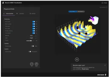
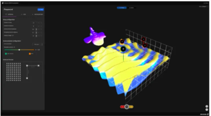
An initial graphical design was created in Figma tool. Over the course of meetings with the technical expert, major is-sues were corrected. The entire design was self-assessed to comply with Ericsson’s user experience guidelines. The design consisted of two main views: initial screen - with a brief description of the application - and “Visualization Playground” (fig. 2). In the latter users could simulate and
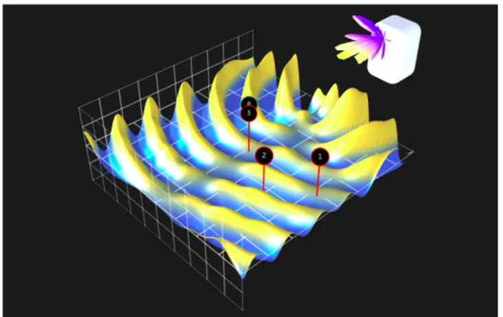
visualize 5G techniques using two types of interactive vi-sualizations: wave propagation plot (fig. 4) and beam di-rectivity plot (fig. 3). The former was an animated surface visualization while the latter was a static three-dimensional model. Users were able to render both visualizations at once in order to make mappings between beam directivity and wave propagation clearer. Apart from the visualizations, the view included a settings window where users could change simulation and rendering parameters.
Figure 2: Design of the “Visualization Playground” view.
Figure 3: Beam directivity plot.
Implementation
The prototype was developed using web technologies. We-bGL was used to create 3D visualizations and user interface was programmed using React9library. As similar
visualiza-tions have been made by researchers at Ericsson before, ex-isting proprietary MATLAB codebase was adopted for the
Figure 4: Wave propagation plot.
generation of the plots. To integrate it with the newly cre-ated web application, it had to be rewritten to JavaScript language. The script accepted a list of parameters related to antenna array and user equipment configurations and returned two sets of cartesian coordinates that were used to plot both visualizations. Description of methods used for data generation is out of the scope of this thesis as is requires deep knowledge of AAS and is the intellectual property of Ericsson.
Initially, significant computation times made the user in-terface unresponsive. In order to increase user experience, data generation was handled by separate threads, using Web Worker’s API10). To make the prototype cross-platform and
independent of external dependencies (like a web browser), it was built using Electron framework. As a result, the appli-cation could be packaged into standalone binaries for most of the widely used operating systems.
Settings
Settings window consisted of three tabs: antenna config-uration, user equipment settings and visualization ap-pearance configuration. The first two were used by the plot generation script and had to be submitted on every change. Changing the visualization appearance settings, on the other hand, had an immediate effect, affecting plots’ pre-sentation features (eg. lighting, scale or visibility) in real-time.
Antenna configuration tab encompassed 13 parameters that were divided into three subgroups:
• Array dimensions settings - including a number of an-tenna elements’ rows and columns as well as spacing between them,
10Web Workers API - Web APIs | MDN -
https://developer.mozilla.org/en-US/docs/Web/API/Web_Workers_API
• Antenna element settings - consisting of specialized parameters related to beam formation commonly used among antenna experts,
• Communication configuration settings - affecting prop-agation channel model and transmission scheme. User equipment settings allowed users to change the quan-tity and spatial positions of the simulated UE’s. Through a drag-and-drop interaction, UE’s could be moved on a two-dimensional square. In order to reduce computation times, the area was limited to a section of space - 10 wavelengths by 10 wavelengths square (approximately 150 by 150 cen-timeters given a 2 GHz carrier frequency).
Wave propagation plot
The first type of visualization represented a unitless scalar field that was proportional to electric field value in time. Using configurations described earlier, Ericsson’s software generated a function Z, such as Z = f (x,y, t) where: x,y -spatial coordinates that lay within the sampling area, t - time. Z was a periodic function, thus required a finite number of samples to generate all possible mappings. The function was represented by a fixed number (80) of three-dimensional sur-face plots. Each sursur-face was sampled 128 times on each axis between area bounds. That resulted in 16’384 scalar values per surface. Plots were displayed individually, being inter-changed on each rendering frame. That, combined with a periodicity of the function created a perception of infinite animation. The visualization was designed to resemble a physical surface wave, similar to those visible on the wa-ter. Aesthetics of the visualization were chosen to match Ericsson’s visualization and branding guidelines. Dark back-ground fitted most of its internal presentation templates and played well with Ericsson’s recent rebranding efforts. Sur-faces were colored using a linear color scale ranging from yellow to blue. The colors were chosen based on their dis-tinctiveness and presence in other tools used by Ericsson’s employees.
Beam directivity plot
The second type of visualization represented an antenna array directivity by a three-dimensional surface. A set of parametric equations generated a point cloud which was translated into a single triangle mesh. Only one side of the beam was rendered as the back lobes had no significant impact on wave propagation pattern. Beam directivity plot was unitless - it represented an angular distribution of the power transmitted from an antenna. Similar visualizations are used by antenna researchers on a daily basis, but mostly as two-dimensional graphs. Plot’s surface was sampled every second degree - generating 8100 points in 3D space. Lower sample densities were evaluated but were inappropriate for
surfaces generated by large antenna arrays. Those antennas produced many small lobes that, combined with small sam-pling densities, were sharp on the edges and aesthetically unpleasant.
Technical evaluation
The low complexity of the visualized plots made the appli-cation capable of running in a full frame-rate, reaching 60 frames per second on medium range portable computers. Although the application could theoretically be run on any web browser that supports WebGL API, no efforts have been made to evaluate its performance on less performant devices (like smartphones or tablets). Initial prototype implementa-tion made heavy use of a popular open-source mathematical library - Math.js. Its similarity to the MATLAB environment made initial development quick and straightforward. How-ever, user studies (described in details in the following sec-tions) have shown that users’ experience fell due to the long computation times. The library’s dynamic nature has proved to be inappropriate for the heavy number-crunching required in plots’ generation process. Fortunately, in recent years, Web API has been extended with low-level data structures that enable performant numerical computations. Original script’s port has been optimized using TypedArrays11and natively
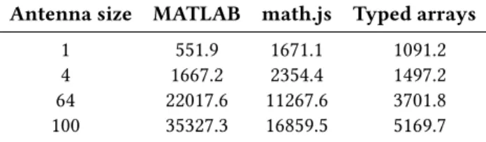
compiled mathematical functions. Table 1 shows the aver-age wave pattern and beam directivity computation times (combined, in milliseconds). The times were computed for the most common antenna array sizes: 64 and 100, as well as the smallest and the largest supported by the tool. MAT-LAB script’s computation times are provided as a reference. Averages were calculated based on 10 consecutive runs on a personal computer using Intel® Core™ i7-8650U processor.
Antenna size MATLAB math.js Typed arrays 1 551.9 1671.1 1091.2 4 1667.2 2354.4 1497.2 64 22017.6 11267.6 3701.8 100 35327.3 16859.5 5169.7
Table 1: Computation times (in milliseconds) comparison between various implementations: reference MATLAB code, using math.js library and using TypedArrays.
An improvement between two JavaScript implementations is clear: TypedArrays made plots’ computation times signifi-cantly lower. The time required to compute 64-element array was of particular importance, as it is a common size of 5G Massive MIMO.
11TypedArray - JavaScript | MDN
https://developer.mozilla.org/en-US/docs/Web/JavaScript/Reference/Global_Objects/TypedArray
Evaluation 1
The first set of testing consisted of 4 individual evaluations with three researchers and one developer. It quickly became apparent that the application does not introduce its graphical elements in a subtle manner. The time between submitting antenna parameters and displaying first meaningful data on the screen was substantially long (especially on slower computers). The application indicated that with a progress bar at the bottom of the settings pane. The usability testing, however, demonstrated that people had not paid attention to that part of the screen. Their confusion was apparent when a plot on the right side became populated with data. Questions like “What happened now?” or “Have I changed something?” were common.
Another issue that was apparent in each testing session was the lack of interest in interacting with the graph. Users perceived 3D visualization as a static, instead of real-time rendering. They did not try to interact with it with a mouse or keyboard. Unfortunately, due to time-constraints, users were not questioned further about their behavior. It is worth mentioning that some of the technical aspects were not clear to users as well. Two out of four participants remarked the lack of preconditions for “channel model” setting. “Chan-nel model” made it possible to see wave propagation in two environments: free space and real environment (simulating scenario with many reflections from physical objects, like buildings). During the debriefing, users were more open about the difficulties they had encountered and gave some suggestions on possible improvements and missing features. Some participants argued that the way signal strength is visualized might not be easy to grasp by novice users and target audience. Moreover, some settings’ labels were un-clear at the beginning and led to confusion. Most notably, users could not understand what “antenna height” setting stood for. Presumably, it was caused by several similar terms that are interchangeable (radio, base station, antenna). Users suggested that the visualization should have included extra parameters that influence radio waves propagation patterns such as artificial obstacles and other base stations but admit-ted that those should be treaadmit-ted as additional features and would rarely be used during presentations. Some imagined the tool to become an extension to their MS Powerpoint presentations and asked whether exporting pre-rendered an-imations and images would be possible. When asked about a presentation that could be facilitated by the tool, participants always started with some basic scenario that was gradually expanded. Some suggested starting out with an antenna ar-ray consisting of 1 element and contrasting it with larger arrays. Alternatively, one researcher proposed a presentation which would start with only one UE and depict the impact of adding more UE’s to the simulation.
Evaluation 2
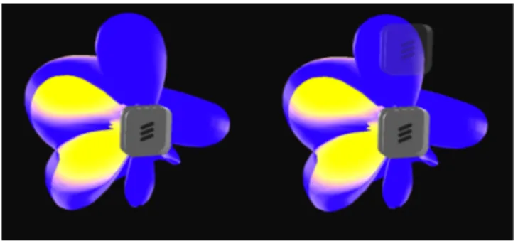
The primary goal of the second evaluation was to assess whether new design improved the overall usability and user experience. Four sessions with three researchers and one developer made it clear that initial reaction to the system got better. Progress bar’s altered position and visualization tran-sition effects (vertical and horizontal blur) helped users grasp the workflow and state of the application. Despite settings’ labels adjustment, users kept complaining about their ambi-guity. In conjunction with “antenna height” label change, a semi-transparent element was introduced to make this set-ting instantly recognizable. Unfortunately, while applying changes on the left side of the screen, users completely dis-regarded what happened on the right-hand side and did not notice the semi-transparent element to appear (fig. 5).
Figure 5: “Antenna height” setting change provided instant visual feedback by showing a semi-transparent base station element.
Only one participant paid closer attention to the visualiza-tion’s appearance settings. (S)he argued that if users were able to export animations and images to other tools, one might need to change colors to match slides’ theme look and feel. Interestingly, 2 out of 4 participants did not try to move, scale nor rotate any of the available visualizations. Two par-ticipants pointed out that the first settings they see in the applications are not the most relevant ones. They added that some of them would rarely be used and might become a distraction for novel users. User observations confirmed that “visualization settings” (affecting charts’ appearance) were hardly used and led to comments suggesting users’ confu-sion (e.g. “I have no idea what that does”). One participant mistakenly led to an erroneous UE’s arrangement, making the application react with a cryptic error message. Although (s)he quickly noticed his invalid configuration and corrected it, it became apparent that the interface should provide a better error handling. Some more technical suggestions in-cluded data importing and exporting and editable antenna precoder. Unfortunately, they could not be included within the scope of this project due to their implementation com-plexity. Similarly to previous testers, participants said that if
they were to use the application during their presentations, they would deliver their message by expanding a simple scenario to a more complex one. Two of them focused on explaining telecommunication jargon like “on a knife edge” or “dead silence” with visualizations. Participants did not pro-vide any new ideas or suggestions that had not been made previously.
Evaluation 3
The last round of testing was aimed to deliver a summative evaluation of the prototype. Three researchers and one an-tenna specialist were employed in that round of testing. Most notable changes included settings rearrangement, additional comments for parameters clarity, more error-prone interface and recording functionality. Users quickly discovered the new set of features and commented on their usefulness. One participant was exceptionally creative and suggested other types of visualizations that could facilitate a dialogue with customers but agreed that the current setup is “good enough” and can become a foundation for further work. Moreover, he noticed that interactivity and high aesthetic value of the project are suitable for its function. The third participant noticed that default settings used for simulation may lead to user confusion and suggested using simplified antenna models for that. Two participants suggested that more real-world objects should be placed in the visualization to make it easier to understand. During the “basic antenna simulation” scenario users focused on explaining “beamforming” and “MU-MIMO” techniques. One of them admitted that such a tool could only be used for “elevator pitches” and lacks advanced settings but added that its visual appeal is perfect for the type of audience they deal with.
Final prototype
Qualitative data gathered during user interviews motivated some substantial changes in the design. The final version of the prototype (fig. 6) included animation capturing, improved labeling, simplified default settings’ values and more config-urable precoder setting. Compared to the initial version, it included simplified “visualization settings”, screen capturing features, more interaction signifiers and more explanatory settings’ descriptions.
System Usability Scale
After each evaluation round, participants were asked to an-swer 10 questions adopted from the System Usability Scale survey using a 5-point Likert scale. Answers from the survey are used to assess the effectiveness, efficiency and satisfac-tion of an artifact and can be converted into a single number (System Usability Scale score) ranging from 0 to 100. SUS score is a widely used metric among usability practitioners and has been proven an accurate method of evaluation for
Figure 6: Final version of the prototype.
small sample sizes [5]. The figure below (fig. 7) outlines the averaged results gathered throughout the study.
85.625 86.875 86.875 SUS Score 0 25 50 75 100
Round 1 Round 2 Round 3
Figure 7: Average SUS score in each round of user testing.
A study conducted by Bangor, Kortum and Miller exam-ined responses from over 1000 surveys [1]. According to them, products with scores over 70 can be considered as “above average” while those which score more than 85 points are rated as “excellent”. That said, results from the user study strongly indicate a high level of usability in the designed prototype. Each round of testing resulted in a score above 85 which can indicate a high level of usability. Furthermore, a slightly rising trend of SUS scores between study rounds is noticeable.
SUS survey consists of 5 positively framed and 5 negatively framed questions. In the former category, higher scores cor-respond to a high level of usability while lower scores values should be interpreted as positive in the latter group. Graphs below (fig. 8 and fig. 9) illustrate average results per each question per group taken from all rounds of testing.
Although it is difficult to make definitive conclusions from this limited data, one might argue that the prototype turned out to have high levels of learnability and ease-of-use. The lowest-rated question among positively-framed ones might indicate that users were not certain about the usefulness of the tool. However, one needs to take into account short
2.83 3.753.173.583.25 SUS Score 0.00 1.00 2.00 3.00 4.00
1. I think that I would like to use this system frequently. 3. I thought the system was easy to use.
5. I found the various functions in this system were well integrated. 7. I would imagine that most people would learn to use 9. I felt very confident using the system.
Figure 8: Average SUS scores - positively framed questions.
0.580.250.670.17 0.33 SUS Score 0.00 1.00 2.00 3.00 4.00
2. I found the system unnecessarily complex. 4. I think that I would need the support of a technical person 6. I thought there was too much inconsistency in this 8. I found the system very cumbersome to use. 10. I needed to learn a lot of things before I could get going
Figure 9: Average SUS scores - negatively framed questions.
evaluation session time and purposefully vague introduction to the system beforehand. As with other types of novel tech-nologies, users tend to demonstrate low eagerness to change and adoption of new tools. Indeed, during the interviews, younger participants were more willing to suggest changes that would help them in their own work. At the same time, older participants were more concerned about details such as labeling and default settings’ values.
7 DISCUSSION Visualization
The study has shown that visualizations can aid communi-cation between antenna experts and non-technical audience. Study participants paid closer attention to graphical design, aesthetics and interactivity, trying to assess whether users would find the tool interesting. Mathematical accuracy and similarity to other scientific visualizations turned out to be a secondary objective when trying to convey a high-level planation of 5G network’s features. Discussions with the ex-perts revealed that technical live presentations impose quite different requirements than those associated with scientific and information visualizations. Usefulness was evaluated through a prism of supporting one’s narrative and affect it may have on the audience. High “data-ink” ratio might have deteriorated the visualization value, making it contradictory
to the rules suggested by Edward Tufte. Moreover, user test-ing has shown that users were not particularly interested in data exploration. Other tools, such as Matlab, were tailored to fulfill these needs and has already become widely adopted by the telecommunication community. The study might sug-gest that complying with well-established rules can lead to sub-optimal user experience and usability of designed visu-alizations. Close collaboration with end-users suggested that in order to support their tasks, affectiveness had to become the primary goal. Strong linkage between affective visual-izations and narrative is evident - visualvisual-izations are often expected to amplify the story being told by the presenter. Affordances & Limitations
Participants demonstrated high interest in the application and found numerous scenarios that could be aided by it. In particular, users found it useful in visualizing “null-forming” and “beamforming” techniques and how those are affected by antenna properties. Showcasing contrasting examples (such as clustered and scattered UE’s) was mentioned by many as well. When asked to conceptualize a hypothetical presentation, users found both visualizations valuable in re-moving misconceptions about 5G technology. Most of the depicted scenarios began with a simple simulation setup which was then expanded to show difficulties and complexi-ties of the new standard. Besides benefits, participants found numerous limitations of the tool. Many argued that only simple scenarios can be visualized and not enough antenna properties were taken into account. Simulating real-world scenarios, including buildings, was mentioned by half of the participants. That could be explained by Ericsson’s mission in educating their clients about peculiarities of 5G networks. Their branding efforts try to minimize the brand image -brand identity gap. Having customers aware of complexities Ericsson is trying to solve improves loyalty to their brand and products. Immersing simulations in real-world scenarios helps the non-technical audience grasp the meaning of the visualizations and their implications. As application aimed to provide a high-level understanding of the phenomena, some assumptions and properties were simplified to make narrations clear. Although it was generally perceived as ac-ceptable, some argued that such an approach could bear more misconceptions and myths about cellular networks. To avoid this, the application should always be used with an expert’s supervision during individual or live presentations. Thus, using it as a self-running presentation should be avoided. Future research
The study proved that the telecommunication community lacks interactive educational tools and see them useful in their work. However, that is just one side of the problem. Future research could be conducted to examine the perceived
engagement of the potential audience of the tool. Involve-ment, attention and perceived aesthetic value are some of the widely used metrics in engagement studies [13] and could be measured in a complementary research. Other types of visualizations could be evaluated in communicating signal strength. The spatial position of markers is not a widely rec-ognizable metaphor for signal strength and further work is required to find a more suitable approach. Moreover, visual cues encouraging direct-manipulation interaction with the graph could be explored in more detail. Lately, minimalist in-teractive manuals called “onboarding screens” have become popular in mobile applications [29]. Utilization of such a mechanism could help novice users discover features that were hardly found during user testing (like visualization affordances).
Method Criticism
In order to draw definite conclusions from the survey-based study, more participants need to be examined. Although SUS survey has been proven to work well in smaller sets of users [5], including more participants would increase the statisti-cal relevance of the results. Moreover, research might have been biased by an extremely low diversity of the study group. All participants were male, European and held higher-level diplomas from well-established universities. Although a lot of effort was placed in finding a more diverse group of testers, telecommunication expertise requirements made it impossi-ble to find suitaimpossi-ble candidates at Ericsson. One may find that the study lacked other types of visualizations that could be used in the prototype. Unfortunately, tight time constraints and a low number of user testing candidates would make it impossible to perform an appropriate comparative study. 8 CONCLUSIONS
The study aimed to examine the affordances and limitations of an interactive visualization tool to be used by telecom-munication experts during presentations for people with less knowledge in the field. Using a Research-oriented de-sign method, a prototype was dede-signed and evaluated with the help of 12 researchers and engineers at Ericsson. Data gathered through usability testing, SUS surveys and semi-structured interviews with participants displayed a high level of usability and usefulness of the tool. Moreover, a list of minor usability issues was thoroughly documented and suc-cessfully corrected in a later version of the prototype. Having been asked about plausible scenarios that could be demon-strated during presentations, users identified many of the tool’s affordances. Most of them focused on removing popu-lar misconceptions about 5G networks and visualizing basic concepts such as beamforming and null-forming. Limitations revealed by the study included a low level of antenna config-urability and poor computational performance. Noticeable
delays between user input and visualization update seemed unacceptable for presentations with key business partners. Interviews suggest that similar applications can only be used under expert’s supervision due to potential misconceptions that can arise. Participants of the study recommended that the visualization should include objects an audience can re-late to.
The research might have been strongly biased by a low di-versity of studied users. To draw any conclusive evidence, a wider set of telecommunication researchers and engineers would have to partake in the study. The study showed a common theme around the way technical presentations are made. Research participants usually started with a simple antenna setup to progressively unveil the complexity of Eric-sson’s technology as they expanded the configuration. That observation may suggest that telecommunication experts are primarily concerned about the comprehension of their audience, omitting technical details for the sake of clarity. Further research should delve deeper into work related to affective visualization, focusing on audience reactions to the tool. Visualization of 5G networks is a relatively novel field. As it grows larger with the rise of the next generation of cellular networks, user experience should be investigated as thoroughly as the technology that enables it.
REFERENCES
[1] Aaron Bangor, Philip Kortum, and James Miller. 2009. Determining What Individual SUS Scores Mean: Adding an Adjective Rating Scale. J. Usability Studies 4, 3 (May 2009), 114–123. http://dl.acm.org/citation. cfm?id=2835587.2835589
[2] Lyn Bartram and Ai Nakatani. 2010. What Makes Motion Meaningful? Affective Properties of Abstract Motion. In 2010 Fourth Pacific-Rim Symposium on Image and Video Technology. IEEE, Singapore, Singapore, 468–474. https://doi.org/10.1109/PSIVT.2010.85
[3] Lyn Bartram, Abhisekh Patra, and Maureen Stone. 2017. Affective Color in Visualization. In Proceedings of the 2017 CHI Conference on Human Factors in Computing Systems - CHI ’17. ACM Press, Denver, Colorado, USA, 1364–1374. https://doi.org/10.1145/3025453.3026041 [4] Emil Björnson, Jakob Hoydis, and Luca Sanguinetti. 2017. Mas-sive MIMO Networks: Spectral, Energy, and Hardware Efficiency. Foundations and Trends® in Signal Processing 11, 3-4 (2017), 154–655. https://doi.org/10.1561/2000000093
[5] John Brooke. 1995. SUS: A quick and dirty usability scale. Usability Eval. Ind. 189 (11 1995).
[6] Stuart Card, Jock Mackinlay, and Ben Shneiderman. 1999. Readings in Information Visualization: Using Vision To Think.
[7] N. Cawthon and A.V. Moere. 2006. A Conceptual Model for Evaluating Aesthetic Effect within the User Experience of Information Visualiza-tion. In Tenth International Conference on Information Visualisation (IV’06). IEEE, London, England, 374–382. https://doi.org/10.1109/IV. 2006.4
[8] Nick Cawthon and Andrew Vande Moere. 2007. The Effect of Aesthetic on the Usability of Data Visualization. In 2007 11th International Con-ference Information Visualization (IV ’07). IEEE, Zurich, Switzerland, 637–648. https://doi.org/10.1109/IV.2007.147
[9] Clayton M. Christensen. 1997. The Innovator’s Dilemma: When New Technologies Cause Great Firms to Fail. Harvard Business School Press,
Boston, MA, USA.
[10] Daniel Fallman. 2003. Design-oriented Human-computer Interaction. In Proceedings of the SIGCHI Conference on Human Factors in Computing Systems (CHI ’03). ACM, New York, NY, USA, 225–232. https://doi. org/10.1145/642611.642652
[11] Elisa Giaccardi and Pieter Jan Stappers. 2017. Research through
Design. https://www.interaction-design.org/literature/book/
the-encyclopedia-of-human-computer-interaction-2nd-ed/ [12] Martin Graham, Jessie Kennedy, and David Benyon. 2000. Towards a
methodology for developing visualizations. International Journal of Human-Computer Studies 53, 5 (Nov. 2000), 789–807. https://doi.org/ 10.1006/ijhc.2000.0415
[13] Ya-Hsin Hung and Paul Parsons. 2017. Assessing User Engagement in Information Visualization. In Proceedings of the 2017 CHI Conference Extended Abstracts on Human Factors in Computing Systems - CHI EA ’17. ACM Press, Denver, Colorado, USA, 1708–1717. https://doi.org/ 10.1145/3027063.3053113
[14] Ohad Inbar, Noam Tractinsky, and Joachim Meyer. 2007. Minimalism in information visualization: attitudes towards maximizing the data-ink ratio. In Proceedings of the 14th European conference on Cognitive ergonomics invent! explore! - ECCE ’07. ACM Press, London, United Kingdom, 185. https://doi.org/10.1145/1362550.1362587
[15] Robert Kosara. 2007. Visualization Criticism - The Missing Link Be-tween Information Visualization and Art. In 2007 11th International Conference Information Visualization (IV ’07). IEEE, Zurich, Switzerland, 631–636. https://doi.org/10.1109/IV.2007.130
[16] Robert Kosara and Jock Mackinlay. 2013. Storytelling: The Next Step for Visualization. Computer 46, 5 (May 2013), 44–50. https://doi.org/ 10.1109/MC.2013.36
[17] Kwan-Liu Ma, I. Liao, J. Frazier, H. Hauser, and H.-N Kostis. 2012. Scientific Storytelling Using Visualization. IEEE Computer Graphics and Applications 32, 1 (Jan. 2012), 12–19. https://doi.org/10.1109/MCG. 2012.24
[18] Gitte Lindgaard and Cathy Dudek. 2002. User Satisfaction, Aesthetics and Usability. In Usability, Judy Hammond, Tom Gross, and Janet Wesson (Eds.). Vol. 99. Springer US, Boston, MA, 231–246. https: //doi.org/10.1007/978-0-387-35610-5_16
[19] J.D. Mackinlay. 2000. Opportunities for information visualization. IEEE Computer Graphics and Applications 20, 1 (Feb. 2000), 22–23. https: //doi.org/10.1109/38.814540
[20] Shiva Nandan. 2005. An exploration of the brand identity–brand image linkage: A communications perspective. Journal of Brand Manage-ment 12, 4 (April 2005), 264–278. https://doi.org/10.1057/palgrave.bm. 2540222
[21] Jakob Nielsen and Rolf Molich. 1990. Heuristic Evaluation of User Interfaces. In Proceedings of the SIGCHI Conference on Human Factors in Computing Systems (CHI ’90). ACM, New York, NY, USA, 249–256. https://doi.org/10.1145/97243.97281
[22] Donald Norman. 2005. Emotional design : why we love (or hate) everyday things (first ed.). Basic Books.
[23] Andrew M. Nuxoll. 2012. Episodic Learning. Springer US, Boston, MA, 1157–1159. https://doi.org/10.1007/978-1-4419-1428-6_1362 [24] C. Friberg A. Furuskär B. Göransson B. Hogan J. Karlsson P. von
Butovitsch, D. Astely and E. Larsson. 2018. Advanced antenna systems for 5G networks. Technical Report. Ericsson. https://www.ericsson. com/en/white-papers/advanced-antenna-systems-for-5g-networks [25] Dinh-Thuy Phan-Huy, Nadine Malhouroux, J Rioult, Y Kokar,
jean-christophe Prévotet, A Le Cornec, Azeddine Gati, T Sarrebourse, Patrice Pajusco, and Maryline Helard. 2017. The Radio Waves Display: An intuitive way to show green techniques for 5G to the general public. 234–240. https://doi.org/10.1109/ICCW.2017.7962663
[26] Francesca Samsel, Lyn Bartram, and Annie Bares. 2018. Art, Affect and Color: Creating Engaging Expressive Scientific Visualization. (2018), 9.
[27] E Segel and J Heer. 2010. Narrative Visualization: Telling Stories with Data. IEEE Transactions on Visualization and Computer Graphics 16, 6 (Nov. 2010), 1139–1148. https://doi.org/10.1109/TVCG.2010.179 [28] Gregory J Skidmore and Gary Bedrosian. 2016. Simulation of
Beam-forming by Massive MIMO Antennas in Dense Urban Environments. (2016).
[29] Brendan Strahm, Colin M. Gray, and Mihaela Vorvoreanu. 2018. Gen-erating Mobile Application Onboarding Insights Through Minimalist Instruction. In Proceedings of the 2018 Designing Interactive Systems Conference (DIS ’18). ACM, New York, NY, USA, 361–372. https: //doi.org/10.1145/3196709.3196727
[30] Karla Straker and Cara Wrigley. 2016. Designing an emotional strategy: Strengthening digital channel engagements. Business Horizons 59, 3 (May 2016), 339–346. https://doi.org/10.1016/j.bushor.2016.01.010 [31] Edward R. 1942 Tufte. [2001]. The visual display of quantitative
in-formation. Second edition. Cheshire, Conn. : Graphics Press, [2001] ©2001. https://search.library.wisc.edu/catalog/999913808702121 In-cludes index.